How to Choose Colors for Your San Diego Photoshoot (Tips from a Local Photographer)
Planning a photoshoot in beautiful San Diego?
From the golden coastal light to the vibrant neighborhoods, color choices play a huge role in how your photos turn out. Whether you're gearing up for a family portrait in La Jolla or a sunset session in Balboa Park, here’s your San Diego photographer’s guide to selecting outfits that pop.

Why Color Matters in San Diego Photoshoots
San Diego’s sunshine, beaches, and distinct neighborhoods set a unique canvas. Bold colors can enhance the scene, while neutrals offer timeless elegance. Finding the right balance ensures your images feel genuine, cohesive, and vibrant.
Colors to Avoid (or Use Minimally)
Neon & Bright Reds: These can cast unwanted reflections onto skin and distract from your subjects’ expressions.
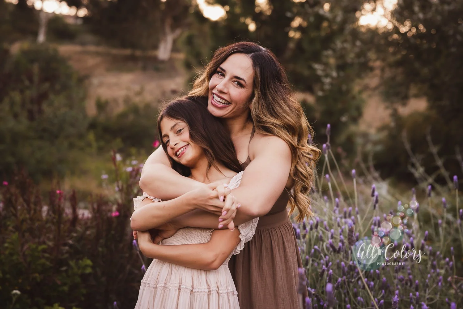
Bright White: A whole bright white outfit often reflects cool tones and can wash out delicate skin tones. Opt instead for cream or soft off-white—it photographs beautifully in San Diego’s warm light. Or in smaller parts of your whole outfit.
Heavy Black or Dark Blue: These very dark colors when used as a whole outfit can hide details and diminish dimension. Dark jeans or trousers are fine, but avoid full monochrome outfits in these shades.
Why Neutrals + Pop of Color Works Best
Neutrals like taupe, sage, and beige let your surroundings shine while keeping the focus on you. When paired with a gentle pop of color—a soft green, rust, or mustard—they add warmth and depth without overpowering the shot.

Use Color Theory to Your Advantage
Complementary Colors: Opposites on the color wheel (like teal and burnt orange) bring vibrancy.
Analogous Colors: Adjacent tones (think sage, olive, and muted green) create a serene, harmonious feel—ideal for beach or park sessions.
Pro Tips from a San Diego Photographer
Match Location Energy:
Beach at golden hour? Try tans, creams, and soft pastels.
Urban or art district? A pop of teal or muted teal-blue adds modern flair.
Accent One Look: Let one person wear a standout color while others complement with neutrals.
Look to Nature: Match colors you love to what surrounds you—like a coral sunset or eucalyptus tones—to create harmony.

Choosing Colors by location:
Beach Sessions: Pastel colors, whites, navy… always with a pop of color. I would avoid neon colors or bright red in any situation because it creates a strong color cast and it draws all the attention to it. I would not recommend the once popular jeans + white t-shirt. If you want to go along that line I would recommend white and navy with a touch of color in accessories, like a jacket or a big necklace. And mix and match the order: some bottoms in blue, some in white, the same for top. Some can even be in all white, like a white dress. As I mentioned before, no shoes are necessary at the beach, so you can cross that off your list. But if possible… pastel color look dreamy at the beach. Long flowy dresses for moms even better. For man, I love shorts with a casual button up shirt.
Trail Sessions: I didn’t use to be a fan of earthy tones in trails and now I just love them! Browns, mute green, ivory, mustard. Keep these colors in mind when booking a trail session. Boots or booties are great for shoes.
Balboa Park/other similar Parks: We are pretty flexible here… I do think bold colors work well in these type of locations. The building are so big and overpowering it is good to actually make a big statement with your color choice.
Little Italy, Downtown or other urban locations: I would recommend casual, modern outfits. The colors might not be so important here, but with me they are always welcome. Headshots: I understand many of us need to wear more conservative colors for professional head shots, like white, navy or black. But that doesn’t mean you can add some pop of color in your accessories. Or even wearing a more creative/edgy cut to make it look out of the box. If you are an artist, bring in the color!
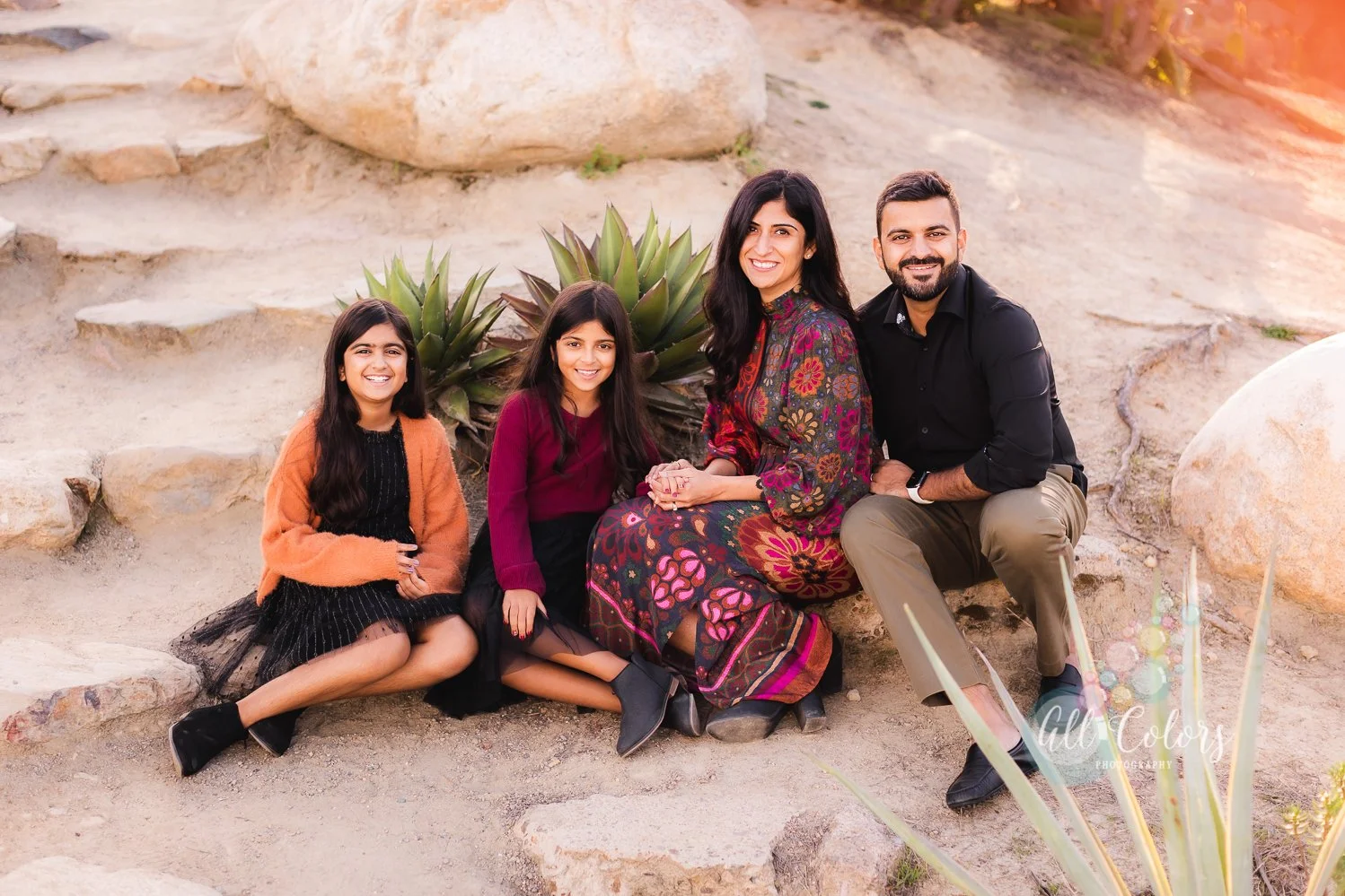
Within the color scheme you choose for your family photos, be playful with the patterns: mix and match between solids, small florals, wide stripes… Over all, some good combos in my opinion are:
Navy, tan, cream
Crimson, tan, denim
Red, grey, black
Navy and fuchsia
Pastel pink and teal
Pastel pink and white
Light blue, tan, white
Navy, grey, white
Tan and white
Light blue, tan, white

Choosing Colors by Season:
If you want to be more specific, here is a good direction for colors by season:
Spring Portrait Colors: Pale pink, Mint green, Baby blue, Cream, Light gray, Lavender
Summer Portrait Colors: White, Yellow, Crimson, Fuchsia, Bright orange, Bold pink, Turquoise, Light blue
Fall Portrait Colors: Browns, Mustard yellow, Burnt orange, Dark shades of green, Neutrals
Winter Portrait Colors: White, Cream, Black, Medium to dark gray, Ruby red, Emerald green
Wrap-Up
San Diego’s scenery deserves to be complemented—not overshadowed—by your color choices. Opt for neutrals with gentle pops, lean into teal or earthy tones, and think about how your outfit works with the coastal or urban backdrop. When done right, your photos will feel timeless, natural, and totally “you.”
